Four charts to get you through turbulent markets

Charts for turbulent markets
Chart 1: Bear markets and corrections are a part of life. Stay focused on the long-term
Looking back at long term charts, it would seem that markets always rise in a straight line, however, when we zoom in a bit closer, we see the volatility markets can bring over the short term. Since 1972, there have been 9 bear markets in global equities in the UK. A bear market is defined as a price decrease of more than 20% from its highs. History shows that equities have typically recovered and have tended to post strong results over the long term and we must remember, we are long term investors and short term volatility is to be expected.

Notes: The chart shows the MSCI World Price Index from 1st January 1972 – 31st December 1987 and the MSCI AC World Price Index thereafter. The shaded areas represent bear markets, defined as price decreases of more than 20% and highlight the area from the time the index lost 20% until it recovers 20% from the subsequent trough.
Source: Vanguard calculations in GBP. Data from Refinitiv as at 22nd March 2023.
Chart 2: Dramatic market losses can sting, Recoveries typically follow
When markets fall sharply like we have seen over the past 18 months, it’s important to stay invested in order to participate in the recoveries that typically follow.
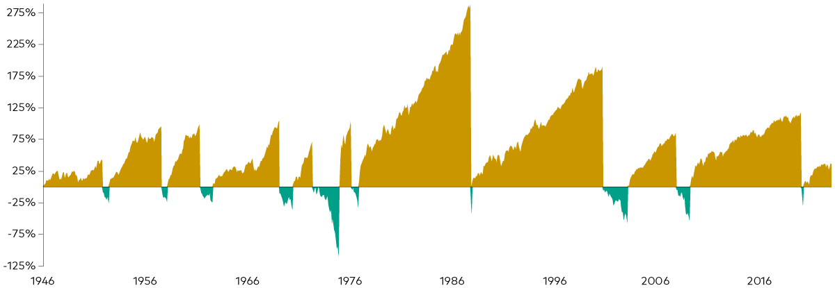
Notes: Calculations are based on FTSE All Shares and data aggregated from Global Financial Data since 1st January 1950, using monthly data. A bear (bull) market is defined as a price decrease (increase) of more than 20%. The plotted areas depict the losses/gains ranging from the minimum following a 20% loss to the respective maximum following a 20% appreciation in the underlying index.
Source: Vanguard calculations in GBP. Global Financial Data and Bloomberg. Data between 1st January 1950 and 31st December 2022.
Chart 3: Timing the market is futile; the best and worst trading days often happen close together
One reason investors shouldn’t try to time the market is they run the risk of missing out on strong performance, which can seriously hamper long-term investment success.
Historically, the best and worst trading days have tended to cluster in brief time periods, often during periods of heightened market uncertainty and distress, making the prospect of successful market-timing improbable.
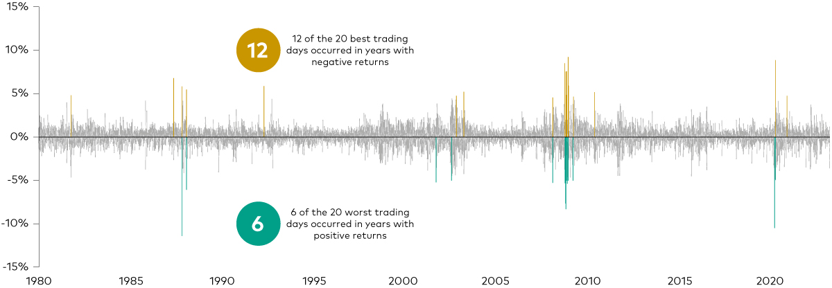
Notes: The chart shows daily returns of the FTSE All Share Price Index. The yellow bars highlight the 20 best trading days since 1st January 1980 and teal bars highlight the 20 worst trading days since 1st January 1980.
Source: Vanguard calculations in GBP. Data from Refinitiv. Data between 1st January 1980 and 31st December 2022.
Chart 4: Don’t panic during market turmoil
Investors who have reacted to market events by moving to cash have seen their portfolios underperform the markets. Long periods out of the market make matters worse.
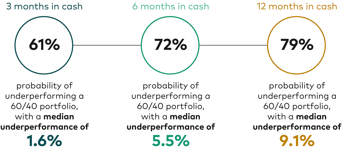
Notes: The chart shows the percentage of times that cash has underperformed a global 60% equity/40% stock portfolio over 3-. 6- and 12-month periods after 2-month total returns of global equtiies were below 5%. For example, global equity returns from 31st August 2008 to 31st October 2008 were -20.74%. Over the following 3-month period until 31st January 2009, cash returned 0.84%, while the 60/40 portfolio returned 1.76%, so that the excess returns of cash were at -0.93%. Equity comprises global equity (MSCI AC World Total Return Index). Fixed income comprises hedged, global bonds (Bloomberg Global Aggregate Bond Index Sterling Hedged). Cash is represented by GBP 3-Month Deposits.
Source: Vanguard calculations in GBP, based on data from Refinitiv. Data is based on the period between 31st January 1990 and 28th February 2022.
Summary
Although we don’t know exactly when markets will begin to recover after a very tough 18 months, I hope the charts above provide some reassurance that generally, markets do recover from these periods and it is prudent to maintain a good asset allocation during these times.
Past performance is not a guide to future performance. The value of an investment and the income generated from it can fall as well as rise and is not guaranteed. You may get back less than you originally invested. The information does not constitute financial advice or recommendation and should not be considered as such. Each situation is unique and should you wish to discuss further, please contact us as your dedicated Financial Adviser.